Table of content:
 Image Source:cloudways.com
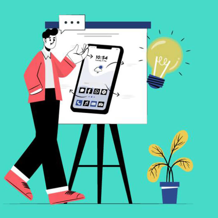
E-commerce is becoming an essential part of business growth every year. We are living in a mobile age of immediacy. Businesses now have to figure out how to get products and services out digitally, quickly, and efficiently.
However, customers have certain expectations when it comes to e-commerce systems that define a retailer’s revenue and more. Today, we will break down the problems impeding e-commerce growth and solutions to retain customers.
By 2021, There Will Be 2.14 Billion Global Digital Buyers
 Image Source: medium.com
Naturally, social media seems to be the heart of the internet. However, e-commerce is just as vital to our online lives.
Statista reported e-commerce was responsible for $2.3 trillion in sales. In the U.S., it represents 10% of retail sales.
E-commerce is a growing, competitive market with a growing pool of customers. And for good reason.
In a less costly way, it brings variety to traditional commerce. You can visit multiple stores and sift through multiple products in a few minutes.
E-commerce also expedites consumption. For example, in educational e-commerce, courses are available according to a student’s time and speed. As such, products and services are rendered at the behest of the consumer.
E-commerce is a much more transparent system. As in, e-commerce sites make it easy to revisit purchase histories and track people’s spending.
There are also more growth and employment opportunities in this business system. With the internet, operational costs are lower, and more people can work from remote locations.
However, like all things, e-commerce is more than a random slew of online sales and products.
The Psychology of The E-Commerce Check Out Process
 Image Source: hubspot.com
The process might be faster, but there are things that drive customers in the check out process.
First, there is the problem/need recognition. People are not likely to spend their money without a good reason. As such, you must convince them that you have a solution for their need.
Second, there is the information search. Nowadays, people turn to the internet to answer their questions and problems. Putting yourself at the front of these searches is vital to motivating more people towards your site.
Third, customers are likely evaluating alternatives or competing providers. Thus, it is important to establish a trusting, transparent relationship with your customers. That way, you get repeated customers and build a positive reputation.
Then, it comes down to the purchase decisions. Throughout a sale, it is important to do two things: ensure your customer knows your product is top quality and do not pressure your customer.
True, it is important to solidify why they came to you in the first place. However, too much pressure could overwhelm customers.
The success of an online purchase rests on several other variables that we will explore below.
Problems Consumers Have with E-Commerce Sites
 Image Source: magnolia-cms.com
According to Practical E-Commerce, internet retailers should engage with customers and ease their shopping experience. However, may e-commerce sites experience oversight in these areas.
The first issue is problem is poor graphic design. A Stanford study discovered that 42% of people do not trust a poorly designed site. Your sites’ aesthetics can define your company’s professionalism and trustworthiness.
Secondly, consumers also dislike an unreachable customer service. A Comscore study discovered that 22% of people abandoned their purchases because they could not reach customer service. It is vital to present your customer service contact information in an easy to access location.
Another issue customer run into is an inability to search and filter their choices. People do not like to click through endless product grids. A layered and filtered navigation style helps customers make purchase decisions more efficiently.
Customers also are less likely to use an e-commerce site with typos. Simply put, typos severely undercut your professionalism. Meanwhile, it also shows a lack of care for your site if you do not proofread your content.
However, one of the costliest mistakes an e-commerce retailer can make is a registration button or login requirement.
A Poorly Designed Site Button Can Cost You $300 Million In Revenues
 Image Source: gosquared.com
The login form is one just about everyone is familiar with. You had two fields for your email and password. Additionally, you had two buttons to login or register, and one link if you forgot your password.
Altogether, this form seemed far from problematic. However, it turns out that this form actually impedes customer purchases. For one major e-commerce site, this button design was costing them a hefty $300 million a year.
The site designers were under the impression that there was nothing offensive or problematic about their design at all. After filling your cart with products, you would click the “checkout” button. However, instead of immediately completing your purchase, you would be prompted to log in.
To the designers, the login or registration button was supposed to expedite the purchasing experience. The site designers believed returning users would recall their login information. New visitors would not mind registering because they were likely to come back.
Everyone would appreciate how quick they can make purchases by logging in. It was a seemingly innocent assumption. Everyone would be happy, right?
Customers Don’t Like Registering
 Image Source: instapage.com
The UIE decided to conduct a registration button usability test. They gave people money to purchase what they wanted from the site. What they found was that the prospect of registering actually turned customers away.
First-time users did, in fact, mind registering. Many first-time users expressed a strong dislike for having to register just to make a purchase. One shopper said it perfectly, “I’m not here to enter a relationship. I just want to buy something.”
Moreover, the designer’s belief that users would recall their login information was incorrect. Some shoppers could not remember if it was their first log in time or not.
Users were consistently bothered by the presence of a registration button. Even if they did not know what the registration entailed, they clicked the button with little excitment. In reality, users only needed to present their name, shipping and billing address, and payment information at registration.
Regardless, people were wary. New customers or users were concerned that retailers wanted their infomation to badger them with promotional materials. Others were afraid that their personal information could be potentially stolen for nefarious reasons.
Repeat Customers Also Find Logins Troublesome
 Image Source:oberlo.com
Like we mentioned, registered accounts are supposed to speed up the purchasing process. Ideally, returning customers would be happy with how quickly they can complete their pruchases. However, repeat customers were just as unhappy as the new customers.
Despite the web designers’ assumptions, majority of repeat customers could not recall their login information. In particular, people struggled with remembering which email they registered with.
Many of them expressed that they had changed email addresses over the years or had multiple email accounts. Actually, after analyzing retailer’s database, we discovered that 45% of customers had multiple registrations in the system.
This inevitably leads to a guessing game that only few succeed at. They could click on the “Forgot My Password” link. However, this only sent a temporary password to an email account they could not remember.
The UIE study actually discovered that about 160,000 people were requesting passwords per day. And even when they received their passwords, 75% of people never completed their purchase. Clearly, the trouble of retrieving login information exasperates customers before a purchase can be made.
In reality, the login or registration form only helps a handful of customers who remembered their logins. Even then, they would have to spend time updating payment or mailing information. Altogether, the form hindered sales more than anything.
Change the Button and Save Sales
 Image Source: hubspot.com
As the registration button deterred people from completing purchases, you are left with a massive revenue loss. More specifically, we found a $300 million loss in revenue.
Fortunately, there is a simple, easy fix. The designers simply replaced the registration button with a “Continue” button. Along with the button, they provided this message: “You do not need to create an account to make purchases on our site. Simply click Continue to proceed to checkout. To make your future purchases even faster, you can create an account during checkout.”
The designers eliminated the pressure of registering for an account. As a result, there was an immediate jump in customer purchases and revenue.
Customer purchasing increased by 45%. The new purchases turned out an extra $15 million within the first month.
There was even an 80% decrease in the number of people requesting passwords. Altogether, the e-commerce site saw a $300 million increase in revenue.
Jared Spool of UIE even received a positive response from the CEO of the retailer. After the redesigning of the registration button, the CEO called him to personally thank him.
It was a high cost problem that required a simple change.
The Benefits of Guest Checkout
 Image source: contentlaunch.com
The “Continue” button or guest checkout option has more benefits than revenue return. First, it can reduce purchase abandonment rates and boost conversion rates.
Second, guest checkout is the mobile-friendly option. According to Outerbox, in 2018, 79% of smartphone users made a purchase on their phones. Mobile transactions are the way to go and guest checkouts only make them faster.
Third, guest checkout gets consumers straight to the payment forms. Presenting consumers with a registration form is enough to make them hesitate in their purchase. The guest checkout efficiently completes the purchase.
Guest checkout are overall less work. No one wants to feel like they are working for a purchase. Guest checkout provides a degree of user-friendliness.
In general, guest checkout is a more efficient and effective process. However, without a registered account, it is difficult to frequently reorder products or deal with returns and exchanges. That is where account checkouts are ideal.
Requiring an Account Still Has Potential Benefits
 Image source:simplilearn.com
While forcing registration is a largely bad idea, there are instances where a required registration is beneficial.
A retailer that sells products that cannot be customized does not necessarily need a registration button. However, a retailer who has products that can be customized or personalized might find registered accounts useful.
In the latter case, a registered account expedites the purchasing process. A registered account keeps everything on track when you need to reorder personalized products or easily deal with returns or exchanges.
Registered accounts are useful if you are a retailer who extends benefits or rewards to your customers. Having a registered account is the best way to hand out rewards or perks to special customers.
In some ways, this might seem restrictive. However, there is no guess work when it comes to registration. Instead, there is immediate benefits and perks.
In these instances, a registration button is quite helpful. Remember, if you have a registration button, frame it as a benefit.
Make Registration Simple and Optional
When it comes to check out, it does not have to be an either/or situation. You can present registration as an option.
One way to do this is to present optional field for users to input passwords. This is a minimal requirement, but it allows users a sense of control. One study saw that users who disliked forced registration would register for a site that only asked for a password.
On top of that, there are several other ways to make your registration pages more user-friendly.
Minimize the Friction in Registration Pages
So how do you make registration feel like a benefit? Like we said earlier, people are more likely to trust a well-designed page. As such, making registrations more valuable starts with well-designed registration page.
First, your sign-up headline should be benefit oriented. For example, Shopify tells users that their membership is free for 14-days. In this way, customers do not feel like they are handing over information for nothing.
Second, make sure you pick the right fields. As in, make sure you are asking customers for the information you actually need. The less you ask for, then the less work they have to do.
Try to use multiple pages for your sign up rather than one long page. The whole process seems less daunting when broken up into smaller steps. You can even try modal windows, which overlays the sign-up window on top of your current page.
Lastly, enable autofill and do not use placeholder text. Autofill generates higher conversion rates because it gets people through registration fast. These small changes led to a 55% increase in conversions for Forisimo.
69.57% Of Online Shopping Carts Are Abandoned as Of 2019
 Image Source: entrepreneur.com
Making your registration pages less distasteful is one aspect of getting customers to stick with their purchase. There are a few other steps that can help get them to the end of checkout.
Like we have mentioned, changing up your check out button design is advantageous. You can choose to create a guest checkout option, a registration option, or both.
After that, you want to make your check out match your site’s overall style. Neil Patel shared that a visual disconnect between the checkout experience and your site can immediately cause abandonment.
The transitions between your cart and the check out page has to be seamless. This way your customers will not be visually alarmed or surprised.
Did you know it matters if you place the billing page before the shipping page? By placing billing information first, the customer feels like you are immediately demanding money.
The customer cares more about shipping. By placing the shipping page first, you are showing your customers that you prioritize their needs. In this way, you solidify the likelihood they will complete their purchase.
Conclusion
Now, you know how check out system designs can impact your e-commerce growth. Done properly, a well-designed check out system can help you create a reputation of trust and retain customers. Otherwise, your check out system can negatively impact your revenues and more.
In short, while e-commerce makes things easier for the retailer, it should also ease the customer’s experience. So long as you are mindful of what your customers want to see and experience, your e-commerce business can soar.
I hope this article has been helpful to you. Please ask us questions or let us know your opinions on registration and check-out systems below!

Article written by
Linda MartinAwesome! Share To :
Receive our news
Mobile Marketing Statistics
Salespeople Skills